
Rowena Hong Psychology
An Study in Creating Branding for a Solo Practitioner.
Client:
Rowena Hong
Role:
UX/UI Designer and Researcher
Date:
Sep/24 - Nov/24
Tool:
Squarespace / Adobe Creative Suite / Notion / Canva
Platform:
Desktop and Mobile
Project Overview
Moving from working within a medical practice to managing her own psychology business, Rowena faced a new challenge when starting as a sole practitioner: The need for a digital platform that would act as a portfolio and allow her to conduct business with patients and practitioners.
This was realised in a website that would fulfill these 3 goals:
Client Communication: Enable existing clients to contact her easily.
Credential Visibility: Allow other practitioners to view her qualifications and expertise for client referrals.
New Business Generation: Attract and convert potential clients searching for psychological services online.
This case study will outline my end-to-end approach to designing and launching the website, empowering the client’s online presence, and driving user engagement.
What was the process?
Initial Consultation
The consultation was to understand the client and uncover her needs and priorities, ensuring the website's design aligned with her goals and target audience.
User Interviews and Research
User research was conducted to test the initial websites and to understand the pain points and needs of potential clients and their customer journey.
Competitor analysis was conducted separately to understand what drew our users to their respective therapists.Personas
Persona profiles were created from the interview data to define the basic structure and user flow of the digital experience.
User Flow
Mapping out the user flow was essential to flesh out the website's structure and navigation, ensuring that the site’s user pathway met needs while maintaining a logical and seamless experience.
Brand Identity
The brand identity was established via a brand guideline to specify the logos, colors, and typeface to be used in external and internal communications. A photoshoot was also done to help cement the brand identity and collateral for the website.
Redesigning the Website
The redesign refined the website's visuals and functionality, ensuring a user-friendly, professional platform with clear CTAs to meet Rowena’s goals. Multiple iterations were carried out to ensure that the website was designed with the end-user in mind.

Initial Consultation
Scoping Out Client Needs
The initial consultation with the client was to set expectations and gather an initial impression of her needs.
As an exercise, the client was asked to design a prototype of her website to assist in prioritizing key features, and for her to better communicate her vision for the final design. These prototypes would then act as scaffolds to build the final website.
Two designs were produced, allowing us to test them with end-users.

Top left and bottom right: Design 1 and Design 2 respectively.User Interviews and Research
Hearing From Our End-Users
Four end-users were selected for user interviews to test both designs, uncovering insights into their needs, behaviors, and preferences. A/B testing was primarily used in this phase.
Users voiced their opinions on the elements of the site ranging from typeface, and colour scheme to user flow and general vibe of the website. The users also help trim and streamline the website sitemap with their feedback
These were some insights gathered from the interviews:
Users preferred websites with images of the practitioner as they felt that how the practitioner looked affected their decision to book the psychologist.
Both initial designs suffered from text sizing issues, making it not accessible for users with visual impairments
Design 2 was preferred over Design 1 for a more direct layout, with clear CTAs and design language synonymous with modern websites.
Users preferred more concise and easy-to-understand blurbs and preferred to not read as much if it wasn’t required of them.
This research informed key design decisions, ensuring the final website was intuitive, user-friendly, and aligned with the client’s goals.

Competitor Analysis
Examining The Competition
Competitor analysis was also conducted separately to uncover current design trends and features that were most effective in engaging users. Three other websites of solo psychology practitioners were reviewed to identify strengths, weaknesses, and opportunities for differentiation in Rowena's website.
One noteworthy observation that was uncovered in this exercise was how information was presented:
The websites analyzed had most of their information about the psychologist on the one home creating an overwhelming user experience.
This made the end-users that we tested feel uneasy and paralysed when going through the respective website.
This reinforced our end-user’s needs; to create a user experience that was accessible, easy to navigate, and would encourage users to book Rowena as for a consultation.

Personas
Understanding User Needs Through Empathy-Driven Profiles


User Flow
Mapping Clear Pathways for Seamless Navigation

This desktop user flow map for Rowena's website outlines how users navigate through key sections, such as Services, Resources, and About, before reaching the Contact page.
During the mapping process, we identified a potential dead-end in the Resources section, where users might struggle to return to other areas of the site. To address this, we recommended implementing a sitemap in the footer, ensuring seamless navigation and reducing friction for users trying to explore more or schedule a consultation.
This proactive approach improves the overall user experience by providing clear pathways to essential actions.
Brand Identity
Capturing the Core of the Brand
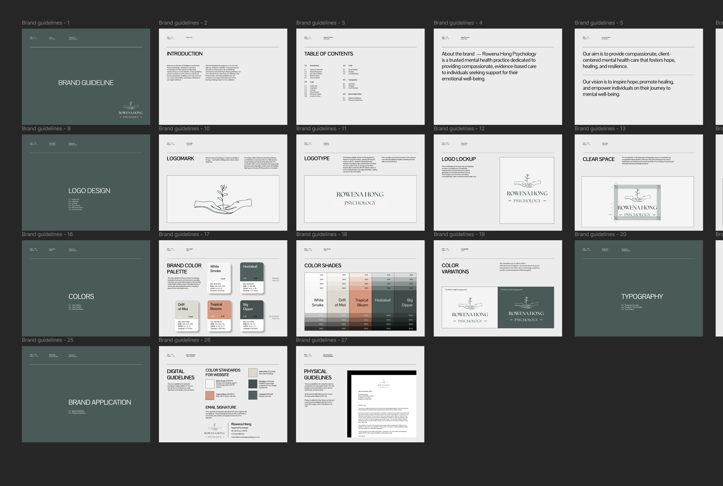
The brand identity for Rowena Hong Psychology was meticulously crafted through a comprehensive brand guideline. This guide outlines the use of logos, color palettes, and typography to ensure consistency across all communications.
Additionally, a professional photoshoot was conducted to enhance the visual identity, providing cohesive imagery and collateral for the website and other brand assets. This unified approach reinforces the brand’s professional, calm, and approachable persona.

Redesigning the Website
Piecing the Puzzle together
The website redesign focused on improving both aesthetics and functionality, creating a professional and user-friendly platform tailored to Rowena Hong Psychology’s goals. Clear calls-to-action and intuitive navigation were prioritized to enhance usability. The process involved multiple design iterations to ensure the final product aligned with the needs of the end user, delivering a seamless and engaging experience.
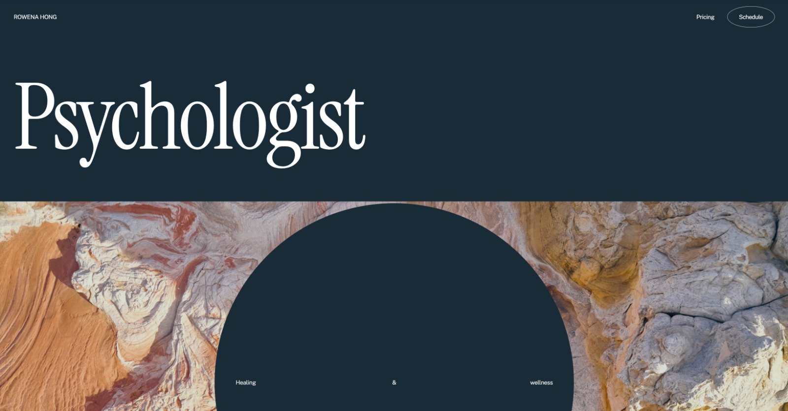
Final Designs
Home page as soon as users land on the page.
An accordion-styled menu that expands upon mental health disorders.
A clear and concise contact form for returning and new clients.
Want to see the site?
Brand Guideline
A document on the rebrand guidelines for internal and external communications for Rowena’s business.
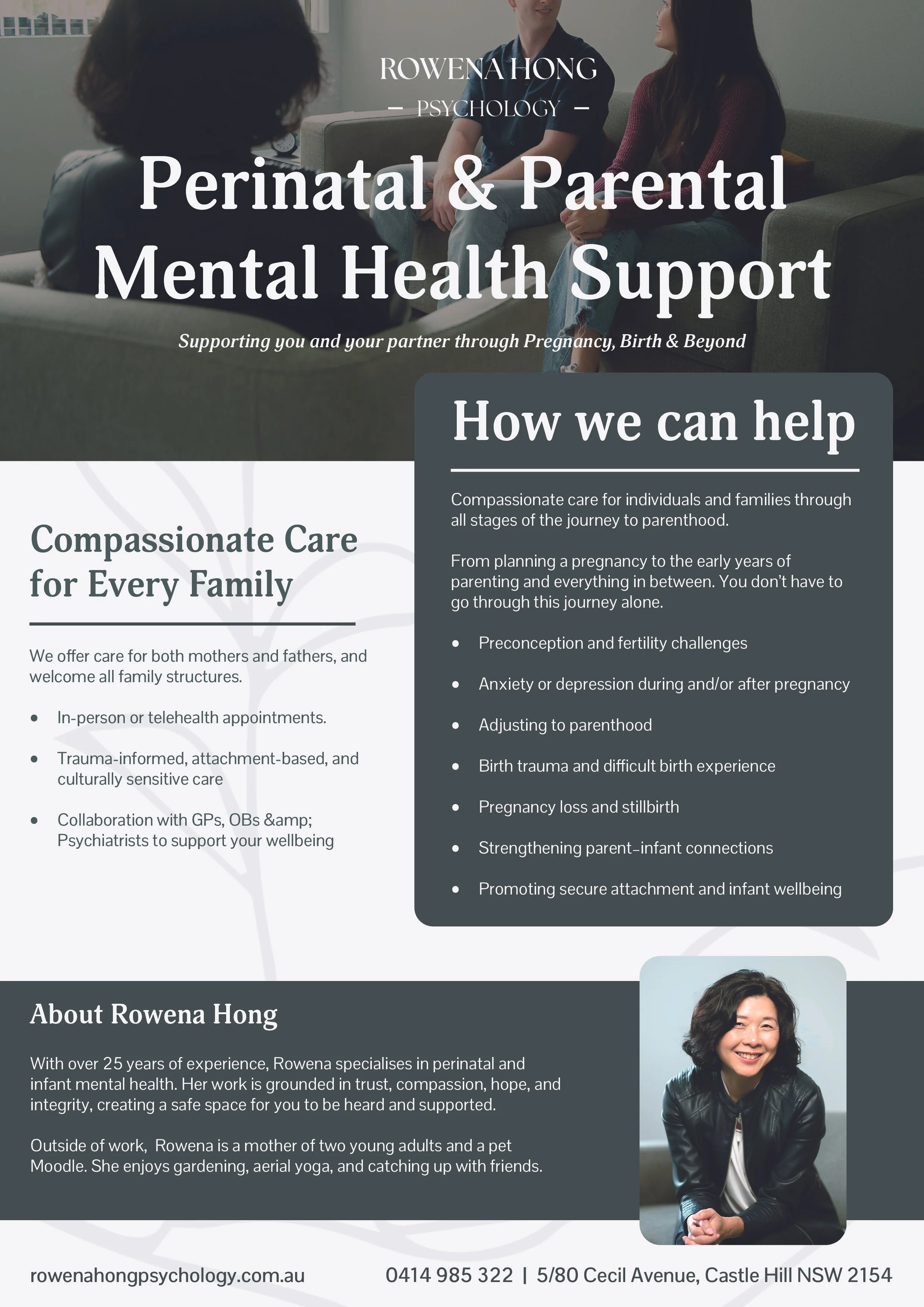
Brand Collateral
Different pieces of collateral that I designed for Rowena’s psychology business. This included a business card design and A5 prenatal services flyer for in-clinic deployment.
A5 sized prenatal services flyer for clinician deployment

Back of the business card

Front of the business card