Superdry® Rebranding
A reimagining of a familiar streetwear brand
What is Superdry®?
Superdry® is a British “Americana-styled“ clothing company, branded with Japanese inspired graphics. Established initially as “Cult Clothing co.” in 1985, it expanded until 2003 where it merged with the skater brand “Bench“ to become Superdry®.
Why the rebrand?

Logo as of 2019
This was an exercise to rebrand one of my favourite brand’s logo and look. I was particularly attached to this streetwear brand when I was doing this project.
Design Rationale
I rebranded Superdry because of these reasons:
Consumers may assume that Superdry is a Japanese brand and this misdirects customers.
Nonsensical Japanese words confuses the international market. The Japanese logo is directly translated from Google Translate and has no meaning.
Superdry is relatively well established and is starting to become a global brand. With a new logo re-design, Superdry will be able to establish and expand on it’s current brand positioning.

Moodboard
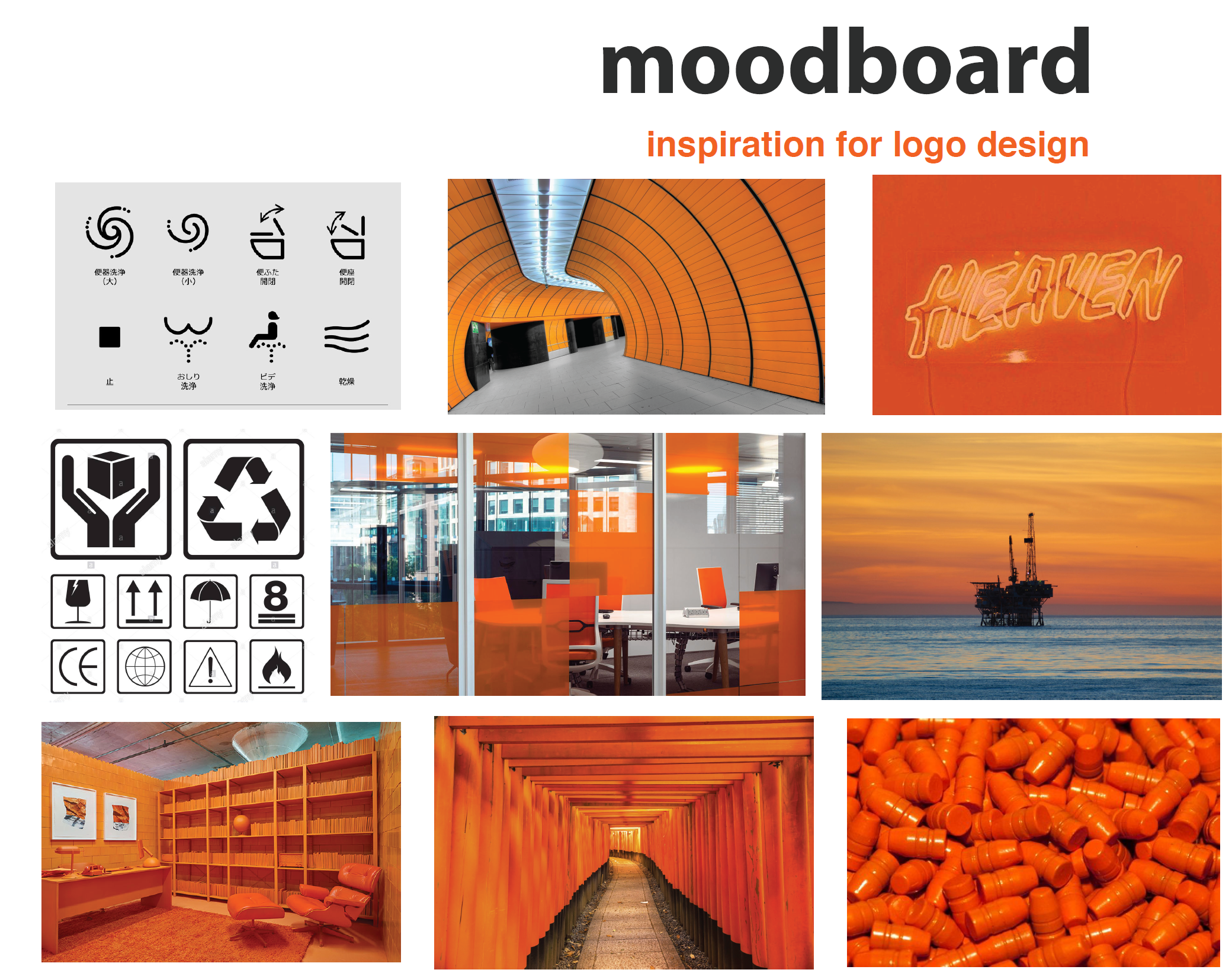
The moodboard tied my rebrand vision and give inspiration to possible designs, tying together themes and colors.
I wanted to rebrand the logo with an infographic, as I wanted to invoke the brands inspiration from Japanese culture. Infographics that explained itself from a glance that had a very clean look was an aesthetic I wanted to go for.
My decision to incorporate orange was to stick closely to the existing brand as it already had a vibrant and fun aesthetic, akin to their company values.
Competitor Analysis
Looking at our current market
I also gathered a bunch of existing brands that were in the streetwear market. This allowed me to analyse their current branding, iconography and Superdry’s current position in the market, whom their customers were and their aesthetic.

Logo Design Sketches

Design Process
Evolution of the logo redesign

Stage 1: Looking at other brands and how they creative icons, most Japanese companies, such as Uniqlo, draw inspirations for icons from stamp seals. The initial idea for the logo came from this notion.

Stage 2: The previous idea was abandoned due to it looking too much like its competitors' logo. Initially the logo is supposed to be a shirt, whilst keeping it's stamp likeness.

Stage 3: The penultimate iteration was inspired by the idea of being "super dry" and evoked imagery of raincoats, a possible direction that the company can adopt to live up to it's name.

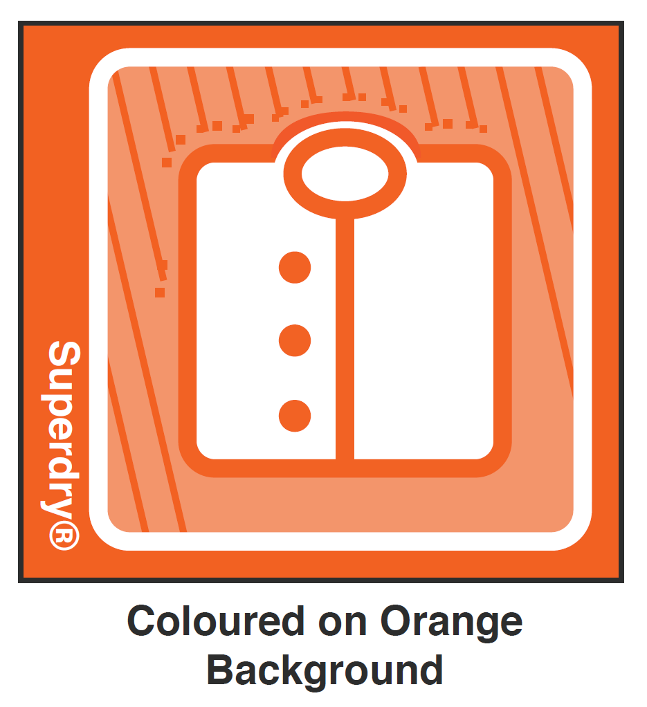
Stage 4: The final logo has all the elements together, with droplests and an "invisible barrier" to give off the notion of being water-repellent and "superdry"
Final Designs
Color Redesign


Color Swatches
Design Choices
Superdry’s current orange colour adheres to their value of being fun and exciting and doesn’t detract away from selling merchandise. Therefore, the main colour didn’t need a change.
A second orange was needed to differentiate parts of the logo if it were to be on orange items. This could also be used for parts that compliment the main orange to fill in what is not the highlights or outlines.
A darker grey swatch was needed to offset the orange, not harshly but subtly for text, outlines or secondary shades for logos, boxes. etc in presentations or other documents.
Finally, the white acts as a neutral background to place the colors into.

Typography
Typeface and fonts

The choice of typography didn’t change as Superdry currently has a flexible font to fit on any piece of clothing.
Insitus
How the rebranding would look like as brand collateral


CX infographic
An infographic on two different example customer experiences

Rebranding Package
A slide deck for external communications.


