PICO: Journaling Reimagined.
A Digital Photo Journal that you can call your own.
What is PICO?
PICO is a digital photo diary that invites its users to connect with their own families and friends through collaborative photo journalling.
On this platform, PICO gives you the tools to tell your story to your family and friends within an interactive interface that is easy and intuitive to use.
The high fidelity Figma prototype scratches only the surface of potential that this product can achieve.
My Role and Key Takeaways
My main role in this project was overseeing the project. This entailed creating goals and making sure we’d achieve them on time, and assisting with team members with their tasks, which would vary from interviewing our target audience to report writing. I was also in charge with the creation of the final demo video.
Being the overseer of this project put me in a role that required leadership skills, and focused on improving my time and group management skills.
Key Takeaways
Goals and deadlines are crucial for a project.
Team members work well with direction and from time to time require check ups for accountability.
Leading people is about bringing the best out of them.

PICO
A Collaborative Vision
Technology has been increasingly used for connecting and engaging people through mediums like mobile applications, websites and mixed-reality tech. The use of newer engagement methods brings challenges for the Australian community as such activities reach a certain demographic. This risks the exclusion of minority groups in the decision making process.
Being an Australian, we believe in giving everyone a fair go, which entails giving everyone equal access to services.
In a team of 4 students, we were tasked with identifying a target group that would be at risk of exclusion and developing a solution that would empower our users in the community.
Discovering the Issue
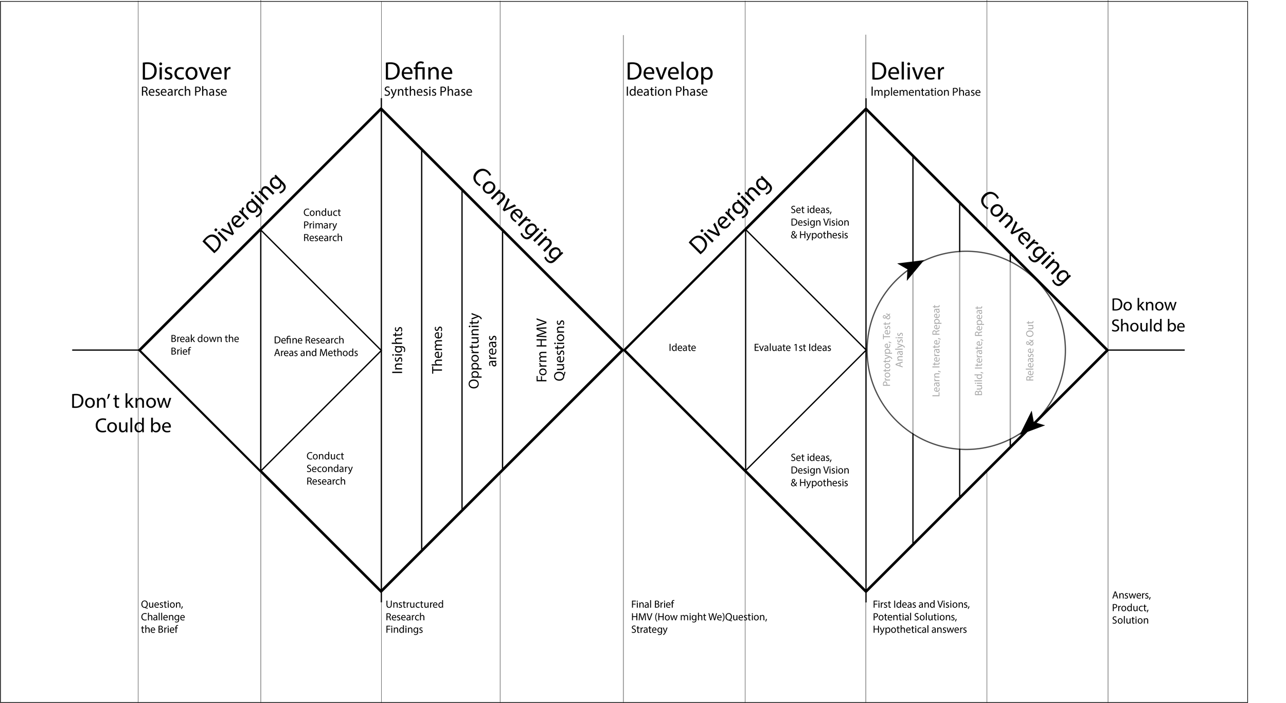
Our team adopted a Double Diamond Approach for this project, incorporating all phases (Discover, Define, Ideate and Implement) into our design process.
User Research
Our first stage required us to diverge our processes, by widening our perspectives, and keeping open to any problems or issues. Before we were to start our research, we devised three main questions to guide our investigation.
> Who was our minority group?
> What issues did this minority group face?
> What research methods were we going to employ in this project?
Our group made a collective decision to research into the elderly population, specifically the elderly minorities that risk being excluded from community participation. Semi-structured interviews with our target audience was conducted as our primary research in tandem with background research to lay the foundation for our investigation.
Asking the right questions was our focus of this step and was something I was picky on as it was crucial to guiding the process of our investigation.

Defining the Issue
Before we could start generating concepts, we needed to generate personas and conduct analysis on our current information. This entailed conducting thematic and competitor analysis which would aid us in creating a product or experience bespoke for our users.
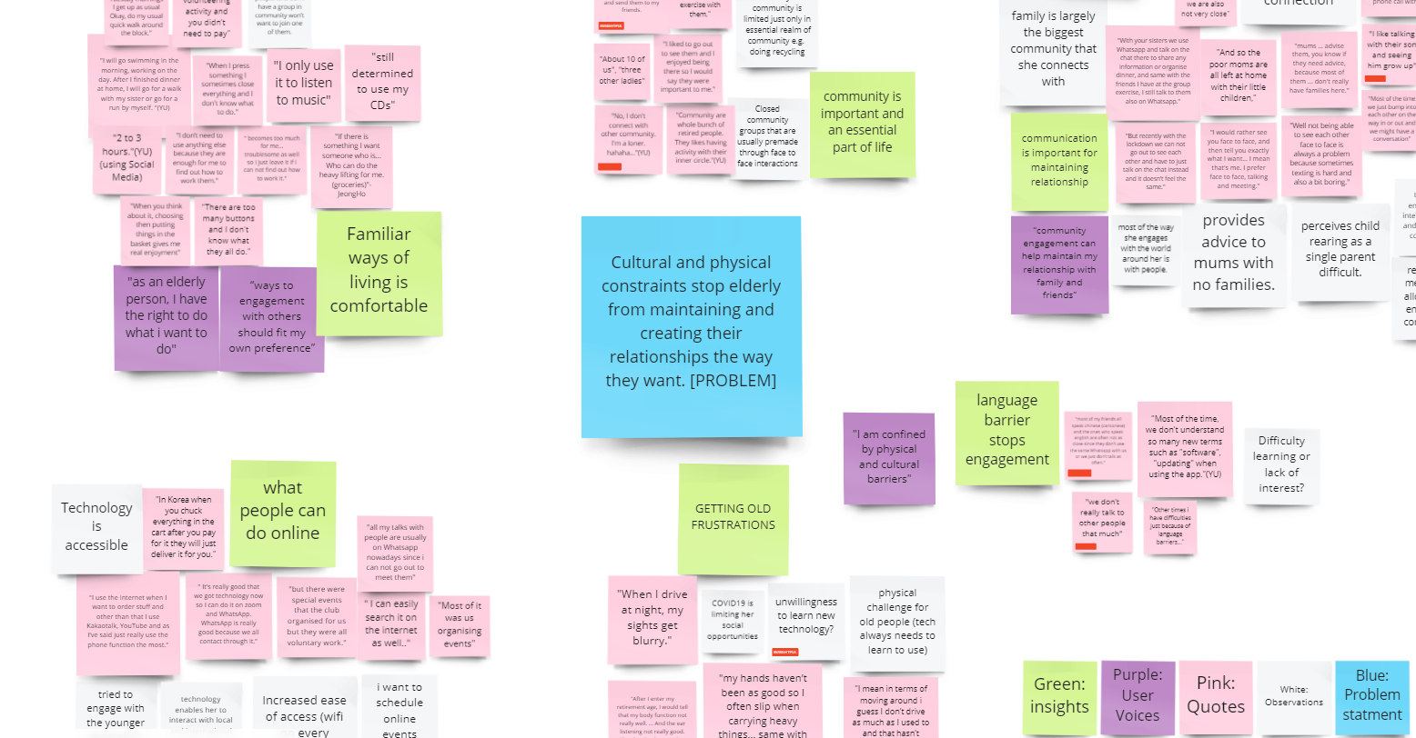
Quotes were organized into subject clusters which were then assigned a user voice to. This process was repeated with our user voices to form our insights.
Come and meet our personas!
Insights and Opportunities
The following stood out to us from our affinity diagram:
Our Elderly minorities…
Believe that communication is important for maintaining relationships.
Believe that familiar ways of living are comforting.
Perceive that language barriers stop community engagement..
Our insights gave us opportunities to create user centric applications or processes to give greater agency to elderly minorities. To ground our thinking, we constructed HMW (How Might We?) questions to guide our design ideation process.
How Might We?…
Empower elderly minorities to embrace changes in their life?
Inspire elderly minorities to connect with communities outside of their language sphere?
Encourage elderly minorities to be proactive in their relationships?
Developing Our First Concepts
Using the analysis conducted, we went through a brainstorming session and came up with 2 ideas each group member, which then 3 were picked out from. The following is a showcase of our concepts in our first stage, in which we showed our users in our user testing to inform the development of our eventual concept: PICO.
This solution was a different interpretation of existing food delivery services but solely focused on connecting seniors in need with lifting heavier loads with people in the community who were willing to help.
Through novel accessibility features, "SocialHub" aims to aid small communities to help the elderly connect with their community around them.
"share", was a concept focused on creating virtual locations which act like digital billboards, allowing users to share messages and drawings at these points of interest.

Testing, Feedback and Reflection
Our 3 concepts were tested with our target users again, with semi-structured interviews with the same users interviewed in our initial problem finding phase. A questionnaire a/b test was also conducted with 10 support workers.
During this testing period:
One user remarked that our ‘share‘ concept was “not bad but not necessary.“
60% of our questionnaire responses said that our concept seemed cumbersome and long to use.Our persona based walkthroughs were created to test the integrity of our concepts.
This user feedback for this iteration pushed us to reconsider not only our current concepts but our problem statement and target audience as I knew we weren’t designing the right product for our target audience.
Reiterate
The First Iteration
With sufficient feedback from our tutor, we narrowed our user audience specifically to elderly immigrant minorities whom resonated with the majority with our insights. We saw that our target group struggled with forging and maintaining a connection with their families due to language and or cultural barriers.
From here, we revamped our solution into what will be PICO, a digital scrapbook where users can connect, share and immortalise experiences with family and friends without language and physical boundaries.
Sketches were made first to outline roughly the architecture of the experience, followed up with a wireframe which was used for our user walkthroughs and SUS(System Usability Scale) tests.
Each profile had to have interactions that would allow users' to connect to fellow collaborators, which included viewing an individual post and their own filtered timeline.
A sketch was done to outline the basic navigation architecture of the user's experience through PICO.

Wireframing
Developed from the sketches, the wireframes were created for a mobile application variant. Our thinking behind this choice was that the majority of our target audience was familiar in using mobile devices (tablets and smartphones), and would be ideal for elderly users to learn and adapt.
User Walkthroughs were conducted with the same users as our define stage, within our interviews, to help us understand the user journey through our prototype
Within our test users:
50% disagreed to feeling confident with using the system.
50% were neutral in thinking that the system was easy to use.
Our wireframe that ordered family members through a tree hierarchy, an analogy that our users may be familiar with.
We wanted to make PICO a place where it was their own, giving them freedom to customise their own profile and organise social events with other family members and friends.
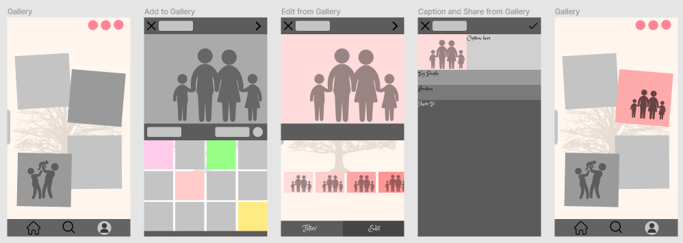
Our gallery, photobook aimed to be intuitive, borrowing similar layouts to existing photo gallery applications, and scrapbooks.
Results
The Second Iteration
Our wireframe insights showed that we needed to create a more user friendly UI that our users could be confident in using. This time, the iteration of PICO was in the form of a website. where we improved upon the interface, adding larger icons and introducing a layout that is reminiscent of a scrapbook.
The same tests were conducted to test the usability of the website and acquire feedback for our next iteration.
This time, 75% of our test users had strongly agreed with feeling very confident in using the website.
This was the general architecture of our website, displaying post making, profile viewing etc.
We implemented an onboarding tutorial in this iteration, to guide new users through our interface.
Our website also included a login page and a brief summary of our PICO has to offer, so our users do not go in blind into the prototype.
The Third Iteration
This iteration aimed to elevate our prototype to a feasible mid-fidelity experience, cleaning up the UI and introducing consistency within our design. This time, our prototype was tested on by fellow peers and tutors, whom would give feedback to drive the final iteration.
PICO was praised for being visually appealing and clean, with interactions being simple and easy enough to follow along.
Our peers gave us the following insights:
Our current prototype was missing features and wasn’t interactive enough.
The platform on which PICO is created on, will determine who will use it.
Using placeholder images makes the prototype feel unrelatable.
We wanted our users to focus on the collaboration timeline, a place where all posts from a family can be viewed and sorted by date. This was changed from the last one which was in a grid format.
One of the interactive features that we added in this version was an image editor, a feature that is seen in other existing social media applications.
Another feature that was added was an interactive map that users could drag around and view posts sorted by location.
The Final Iteration
Our final iteration replaced all the stock art with one of our personas as recommended from our previous feedback. Another feature we implemented was our live translation tool, a feature we wanted to implemented from the start as language and cultural barriers were a main obstacle for our users’ relationships.
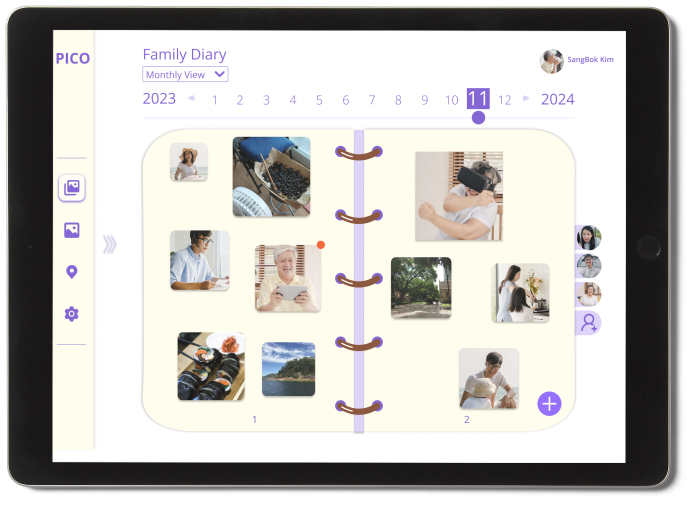
A new theme for our UI was also implemented as well, with a design that emulates a diary.
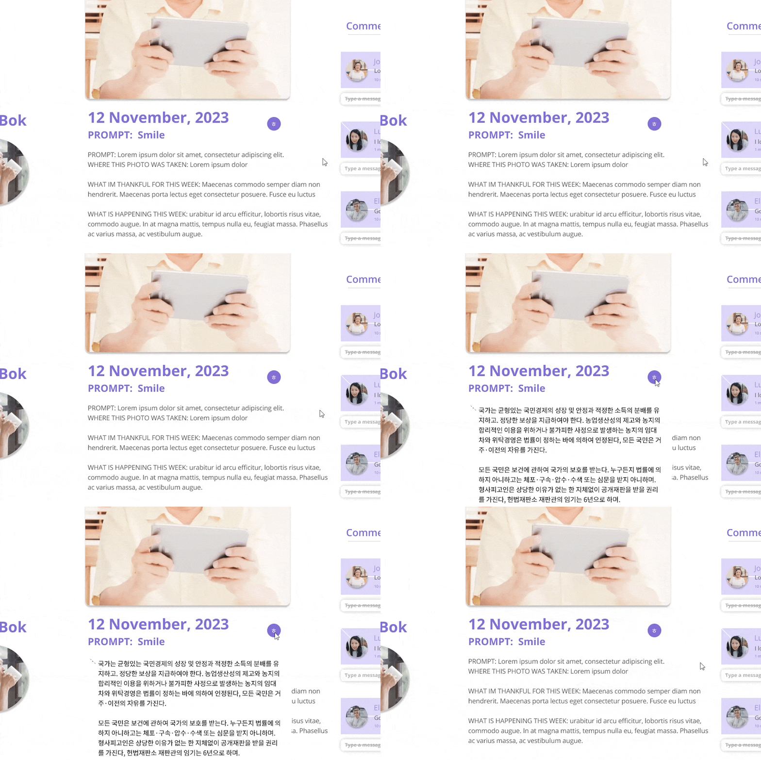
The live translation tool aims to help our users who want to understand posts in their native language.
Our new and improved interface mimics a photo diary.
Final Concept
Laptop and Tablet Insitus


Curious about the details?
You can find our whole project write-up below


